React Pincode Component with Grommet.js and react-pin-input node.js package
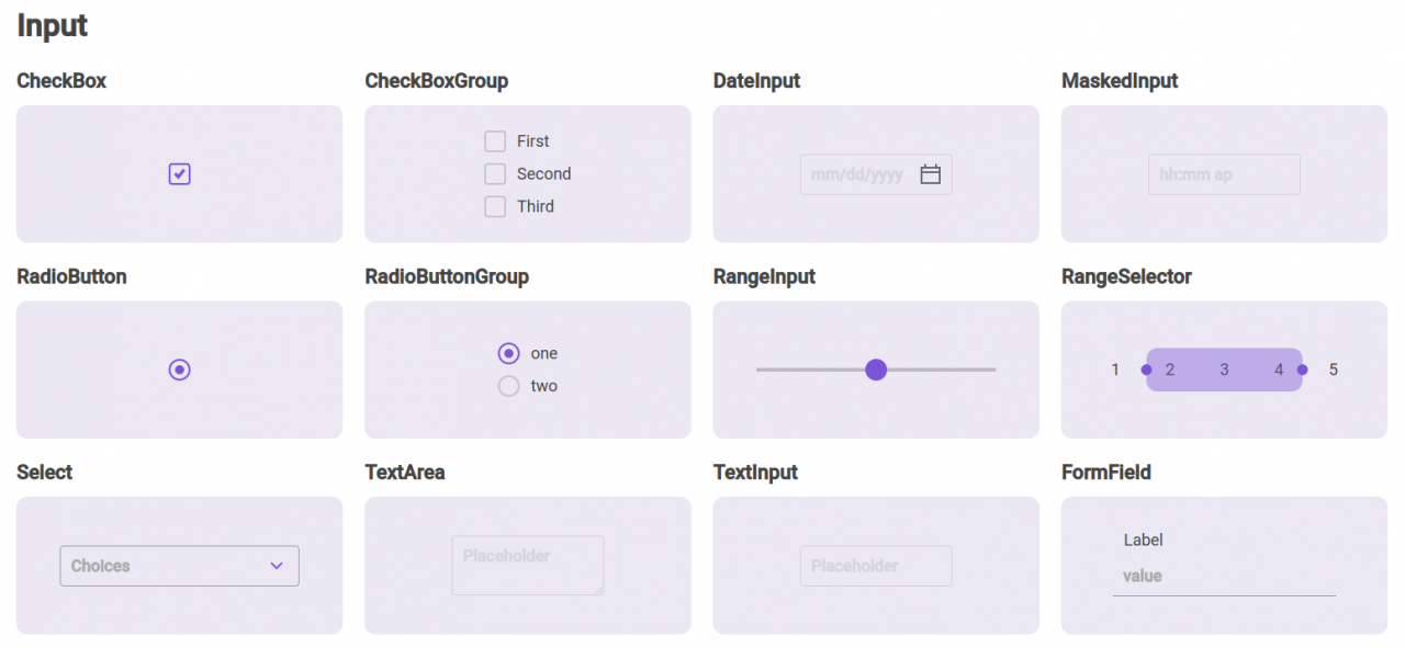
Grommet.js is a ReactJS library made by developers of Hewlett-Packard. There are many libraries to help a developer building nice frontends, but Grommet.js is a bit of different flavor in the world of Bootstrap and Material based libraries.
Grommet.js is packed with ready to use components and comes free of charge.

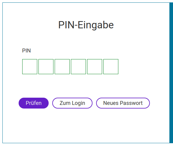
In this article I want to show how I did a Pincode form with Grommet.js and a the react-pin-input node.js package.

Install the react-pin-input package
The ReactJS components
I have created seperate components for:
- Pincode Form
- Pincode Field
The form
import React from "react";
import {Box, Form} from "grommet";

import PincodeField from "./fields/PincodeField";

import SubmitButton from "./buttons/SubmitButton";
import FormButton from "./buttons/FormButton";

function PincodeForm (props) {

    const handleSubmit = ({value}) => {
        console.log(value);
    };

    return (
        <Box align="stretch" justify="center" direction="column">
            <Form
                onSubmit={handleSubmit}
                validate="blur"
                messages={{
                    invalid: 'Pincode is invalid',
                    required: 'This field is required'
                }}
            >
                <PincodeField/>

                <div className="form-buttons">
                    <SubmitButton type="check"/>
                    <FormButton type="login"/>
                    <FormButton type="forget"/>
                </div>
            </Form>
        </Box>
    )
}

export default PincodeForm;
Pincode Field
The field is defined to be 6 characters long where only numbers can be entered [0-9]. On the documentation page of this package you can find more information on how to modify the pincode.
The pincode is not really a formfield, but with a little trick you can use a hidden field as intermediate to submit the right value with the form.
<TextInput id={id} name={name} hidden value={pinCode} />in combination with:
const [pinCode, setPincode] = useState('');

const onComplete = (val, idx) => {
    setPincode(val);
    console.log(val, idx);
}

const onChange = (val, idx) => {
    if (val.length < pincodeLength) {
        setPincode('');
    }
}
So the onChange and onComplete events of the pincode field you validate and react to tell the user that not all numbers are entered. And when completed you set the value of the hidden field, ready to submit and validate it on the server.
The secret configuration parameter has been disabled, for I want my users to see what they enter. But when activated it won't show the code entered.
The length of the code has been set with useState, for it is intended to move this to a global state that initialized with settings that are fetched from an different source (server). So you could also do this with:
const pincodeLength = 6;The complete code of this component:
import React, {useState} from 'react';

import {FormField, TextInput} from 'grommet';
import PinInput from "react-pin-input";

const {id, name, label, required} = {
    id: 'input-pincode',
    name: 'pincode',
    label: "PIN-Kode",
    required: 'required'
}

function PincodeField(props) {

    const [pinCode, setPincode] = useState('');
    const [pincodeLength, setPincodeLength] = useState(6);

    const onComplete = (val, idx) => {
        setPincode(val);
        console.log(val, idx);
    }

    const onChange = (val, idx) => {
        if (val.length < pincodeLength) {
            setPincode('');
        }
    }

    return (
        <FormField
            name={name}
            htmlfor={id}
            className={required ? 'required' : 'not-required'}
            label={label}
            required
            noBorder={true}
        >
            <PinInput
                length={pincodeLength}
                initialValue=""
                // secret
                onChange={onChange}
                type="numeric"
                inputMode="number"
                style={{padding: '10px'}}
                inputStyle={{borderColor: 'green'}}
                inputFocusStyle={{borderColor: 'blue'}}
                onComplete={onComplete}
                autoSelect={true}
                regexCriteria={/^[0-9]*$/}
            />

            <TextInput id={id} name={name} hidden value={pinCode} />

        </FormField>
    )
};

export default PincodeField;
A little bit of SASS/CSS to make it complete
.pincode-input-container {
    .pincode-input-text {
        font-size: 30px;
        font-weight: bold;
        font-family: 'Roboto', sans-serif;
    }
}


